Follow the steps below to get you started:
HTML/css Stylesheet folderHTML/fonts Fonts folderHTML/img Images folderHTML/js Scripts folderHTML/php PHP Functions folderHTML/index.html HomepageYou can choose between 6 styles of header. Simply by adding the header style CSS class to the header tag will activate the header style. The list of header style classes & its descriptions are provided below for your reference:
<nav class="navbar navbar-default"> | Default header with a white background & dark menu. |
<nav class="navbar navbar-default fullwidth"> | Fullwidth header |
<nav class="navbar navbar-default transparent"> | Transparent into smaller with white background |
<nav class="navbar navbar-default transparent-dark"> | Transparent to smaller with dark background |
<nav class="navbar navbar-default dark"> | Dark header with light menu. |
<header class="navbar navbar-default transparent dark-menu"> | Transparent header with dark menu. |
Based on latest Bootstrap and uses the 12 column grid system for the underlying structure of each section. Each use of the grid should be wrapped in both a container and row element. Below is a brief example for a section with three equal columns (3 for tablet and up, 6 for smartphones).
For a more detailed explanation of the Bootstrap grid - see the Bootstrap documentation Bootstrap Grid
Wander uses helper classes to space elements out from one another on the page. Helper classes are used to space elements with margin and padding. This makes it easier to create your own elements in HTML without needing extra CSS to arrange them appropriately.
Example: You have a heading that you'd like to push 100px away from the subsequent content by adding margin to the bottom. You can use spacing classes to help:
<h1 class="mb100">I'm a heading</h1>
Spacing works on multiples of 10. This means you can use classes as such: mb10, mb20, mb30, mb40, mb50 and so on up to mb100.
mb' refers to 'margin-bottom'mt' refers to 'margin-top'ml' refers to 'margin-left'mr' refers to 'margin-right'For padding we have used 'pb' instead of 'mb' where 'pb' refers to 'padding-bottom'.
pb' refers to 'padding-bottom'pt' refers to 'padding-top'pl' refers to 'padding-left'pr' refers to 'padding-right'Wander comes with 4 types of hero home sections: Image, Slider, Content Slider and Video hero.
You can find them in files listed below:
/home-slider-fullscreen.html/home-slider-fullwidth.html/home-content-slider-fullscreen.html/home-content-slider-fullwidth.html/home-video-fullscreen.html/home-video-fullwidth.html/index.html/home-parallax-fullwidth.htmlWander uses the Owl Carousel jQuery plugin to handle all slider behaviour including image sliders and hero sliders.
All sliders are mobile touch friendly and they have navigation arrows for desktop mode.
Image sliders can be found in features-slider-columns.html file and they are always structured as:
    <div class="image-slider1 owl-carousel navigation-thin pagination-in">
        <div><img src="image-link" class="img-responsive" alt="#"></div>
        <div><img src="image-link" class="img-responsive" alt="#"></div>
            ...
    </div>
Many sections have images that cover the background and these backgrounds can be parallax or static.
Background images are linked through css classes like bg-img-1, bg-img-2 and so on.. You can find them all in css/custom.css file.
Example: to place a background image for a section and make it static, add image class bg-img-1:
    <section class="bg-img-1">
        ...
    </section>
to make it parallax, add class parallax
    <section class="parallax bg-img-1">
        ...
    </section>
you can also add class overlay to cover the image with dark transparent dot pattern.
    <section class="parallax overlay bg-img-1">
        ...
    </section>
Wander uses 2 sets of amazing premium icon fonts: Ion Icons, and Et Line Icons.
Using the icons requires you to follow simple syntax using the predefined icon codes:
<i class="ion-heart">
For a list of all available icon codes see pages below:
/elements-icons-ion.html/elements-icons-et-icons.htmlBy default, the icon will appear at very small size. You can adjust this by adding some size classes:
size-1xsize-2xsize-3xsize-4xsize-5xsize-6xsize-7xsize-8x<i class="ion-heart size-4x">
Wander provides a very elegant way to showcase your work. You can choose between many variations of portfolio from main folder.
To set up new portfolio, please use the following codes:
Portfolio filters setup:
    <div class="portfolio-filters-center cbp-l-filters-button" id="js-filters">

        <div data-filter="*" class="cbp-filter-item-active cbp-filter-item">All</div>
        <div data-filter=".branding" class="cbp-filter-item">Branding</div>
        <div data-filter=".graphic" class="cbp-filter-item">Graphic</div>
        <div data-filter=".web" class="cbp-filter-item">Web</div>

    </div>
Portfolio items setup:
    <div class="portfolio-grid-fullwidth cbp" id="js-grid">

        <div class="cbp-item branding web">
            <a href="portfolio-project-carousel.html" class="cbp-caption">
                <div class="cbp-caption-defaultWrap">
                    <img src="img/portfolio/grid/1.webp">
                </div>
                <div class="cbp-caption-activeWrap">
                    <div class="cbp-l-caption-alignCenter">
                        <div class="cbp-l-caption-body">
                            <div class="cbp-l-caption-title">Rewind Watch App</div>
                            <div class="cbp-l-caption-decs">Branding, Web</div>
                        </div>
                    </div>
                </div>
            </a>
        </div>

</div> css/colors/ folder. To use one of them follow steps below. You can change your website's color scheme in an instant:
Open your html file and in the head you'll find blue.css stylesheet linked:
<!DOCTYPE html>
    <html lang="en">
        <head>
            <meta charset="utf-8">
            <title>Wander Multipurpose HTML Template</title>
            <link rel="icon" href="img/assets/favicon.webp" type="image/png">
                ...
            <link href="css/colors/blue.css" id="color-scheme" rel="stylesheet" type="text/css">
        </head>
Simply change blue.css link to any of the 10 premade color schemes:
<link href="css/colors/red.css" id="color-scheme" rel="stylesheet" type="text/css"> Wander uses 3 Fonts namely: Raleway, Lovelo & Open Sans from the Google Fonts Library. You can find the linking to the font files in the head tag of all the .html files.
<link href="fonts/lovelo/stylesheet.css" rel="stylesheet" type="text/css">
<link href='https://fonts.googleapis.com/css?family=Raleway:100,200,300,400%7COpen+Sans:400,300' rel='stylesheet' type='text/css'>
In order to add or change the fonts, you will need to add new google font link or replace the above link with your new google font. After that in css/theme.css file you can change all the font-family: names with your new font name.
To change the google map address, open html file that contains google map section and simply put your address or coordinates inside "map-coordinates" and "marker-coordinates" attributes:
<!-- Google Map -->
<section
     map-coordinates="40.776773, -73.981351"
     marker-coordinates="40.775075, -73.981179"
     info="Come visit us today!<br>4th West St, New York"
     id="map" class="map-style-1 height500">
</section>
<!-- End Google Map -->
The subscription form is integrated with Mailchimp mailing list. You need to have an active Mailchimp account and to create a list.
Once you have the Mailchimp account and list you have to configure the subscription file with your API Key & List ID. In php folder open the subscribe-mailchimp.php file and and change the variables:
// Authentication
$api_key    = 'your-api-key';
$list_id    = 'your-list-id';
- How to find or generate your API Key * http://kb.mailchimp.com/accounts/management/about-api-keys
- How to find your List ID * http://kb.mailchimp.com/lists/managing-subscribers/find-your-list-id
Notice: php files can only work on your server so upload the site to your server when testing.
Contact form is fully setup and only thing to make it functional is to put in your email address.
Inside php folder open contact-form.php file and change the email address on line 45:
Discover more about 问鼎娱乐官网 with 问鼎app.
45 $address = "[email protected]";
To show your twitter feed you need to replace twitter widget ID in html files with your own:
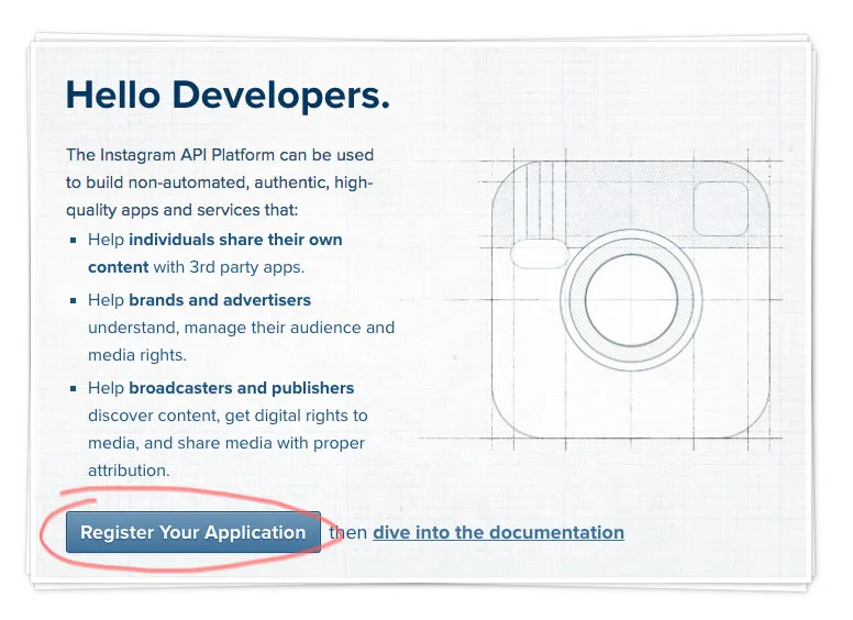
<div id="twitter-feed" data-twitter-widget-id="455427632419442688"></div> In order to get feed from your Instagram user account, you will need to register an app on Instagram developer site.
Please follow this steps:
Visit https://www.instagram.com/developer and register a new app.
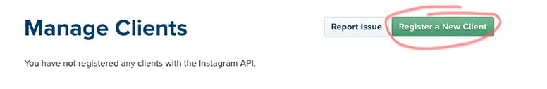
Click on Register a New Client.
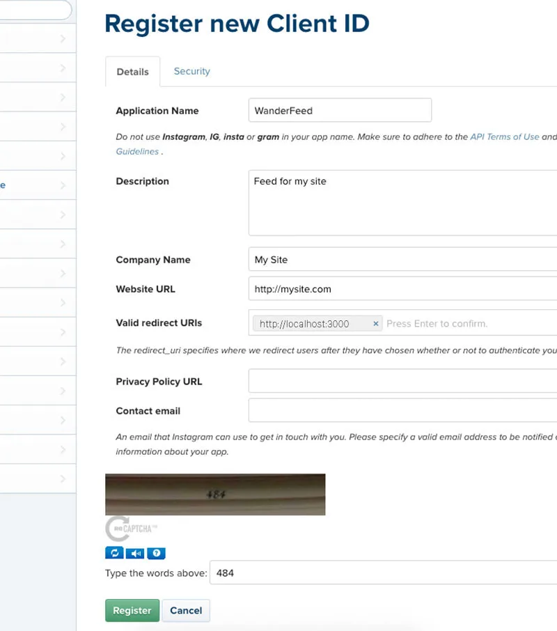
Fill the fields with the same info as in image.
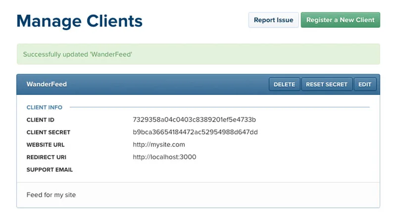
Copy the Client ID here, or at least keep this tab open, you will need the Client ID soon.
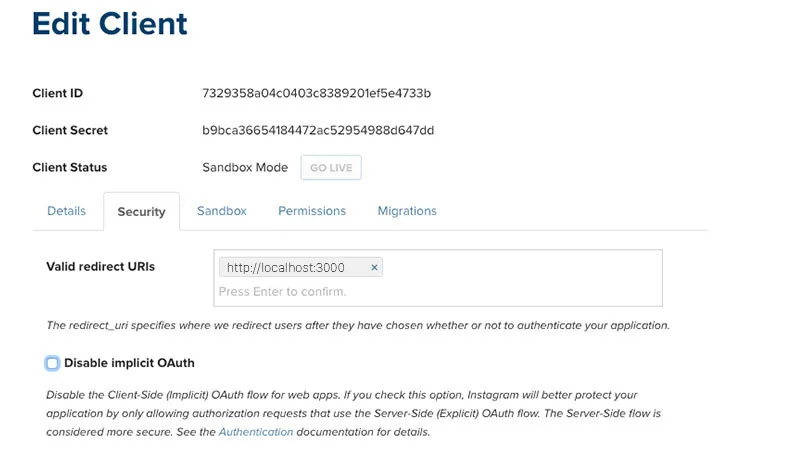
Click ‘Edit’ on your app from the Manage Clients screen, then open the ‘Security’ tab and uncheck the ‘Disable Implicit OAuth’ since we’d like the public to be able to see our feed.
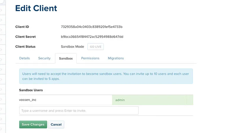
Again click on 'Edit' on your app and open the ‘Sandbox’ tab and confirm you are the ‘admin’ of this app.
Open your browser and paste the url below, replacing the string after "client_id=" and before the "&" symbol with your Client ID you saved earlier, and hit Enter to visit this URL:
https://www.instagram.com/oauth/authorize/?client_id=7329358a04c0403c8389201ef5e4733b&redirect_uri=http://localhost:3000&response_type=token&scope=public_content
Remember: Replace the "7329358a04c0403c8389201ef5e4733b" part of this url with your Client ID. You can access the Client ID again from the Instagram Developers site on the Manage Clients page.
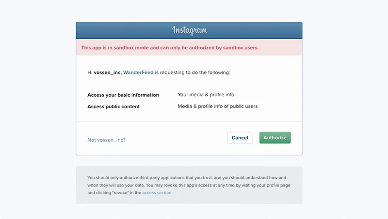
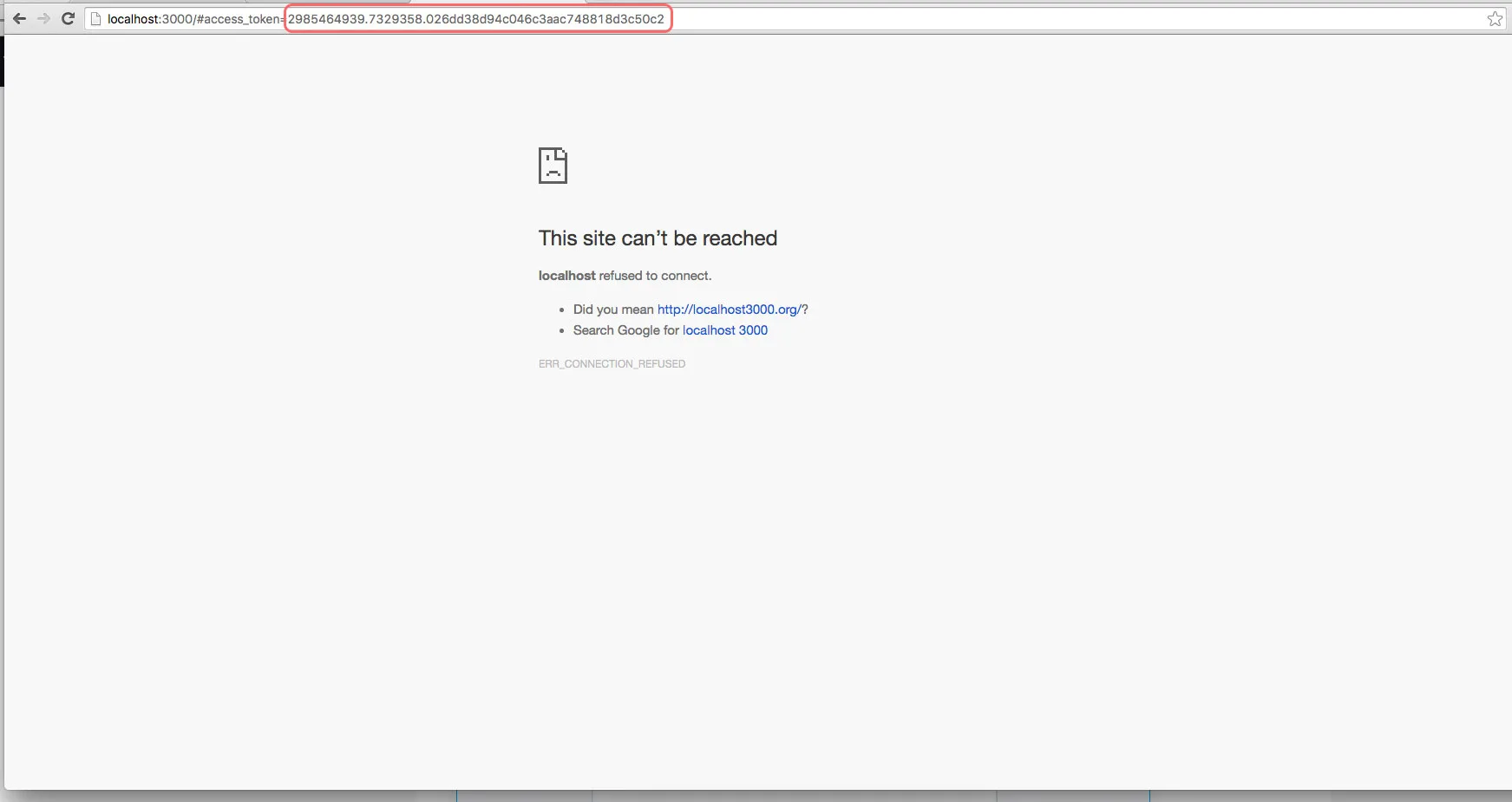
Visiting the URL we made with the Client ID will bring up an ‘Authorize’ screen. At this point, you are using your local server to simulate an API connection, and you will Authorize it to get a view of the Access Token response. Click ‘Authorize’.
This page appears broken, but it has a critical bit of data in the URL… right after "#access_token=" you can grab your public Access Token, which also has your ID in it. According to this response, the access token is: 2985464939.7329358.026dd38d94c046c3aac748818d3c50c2
Open scripts.js file from "js" folder and search for instagram.
Paste your Access Token number between quotation marks on accessToken line and your Client ID number at clientID line.
Replace vossen_inc user name with yours at you're done.
accessToken: '2985464939.7329358.026dd38d94c046c3aac748818d3c50c2',
clientID: '7329358a04c0403c8389201ef5e4733b',
query: 'vossen_inc', Updated on 4th June, 2016
- FIXED - Instagram Access Token
Files Changed:
Updated on 30nd April, 2016
- FIXED - YT Video Background Responsivness
- FIXED - Header Nav Single Links
- FIXED - Team Images Hover Stutter
- ADDED - One Page Menu Scrolling Demo
- ADDED - Simple Header Feature File
Files Changed:
Files Added:
Released on 26nd April, 2016